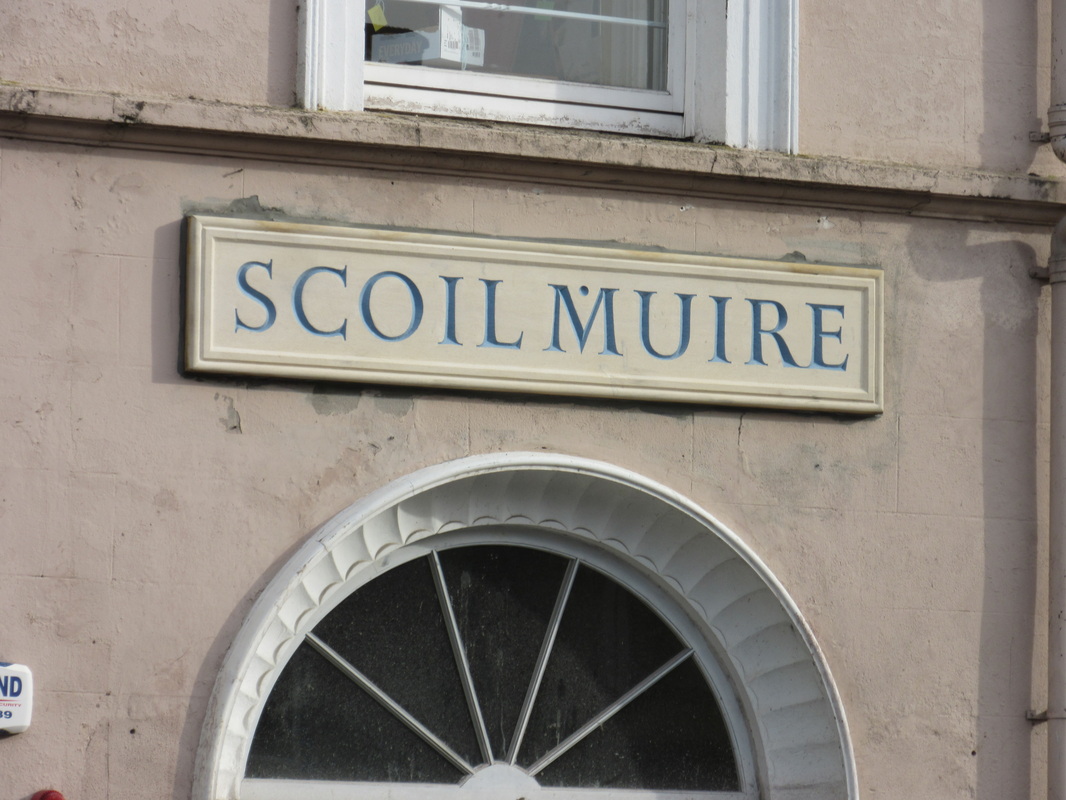
| I noted this sign being put up at Scoil Mhuire last Friday. It replaced a thinner sign that was included in a post last year. When I first went past, I thought that there was an error in the spelling. It should be ‘Mhuire’ and not ‘Muire’. In full daylight, I noted the dot over the M, which in times past and in Gaelic fonts, used to represent a following ‘h’. I suspect that if any pupil of Scoil Mhuire used the dot in exams, the marks may not be as high as using a ‘h’ – a perfect example of do what I say, not what I do. | Before the 1960s, aspiration (aka, lenition) was symbolized by putting a dot over the consonant. Since the 1960s, it's been symbolized by putting an h after the consonant. The lenited consonant is denoted by a following h. |
In some older books, you'll see forms of the letters that are quite different from normal roman letters, for example: ſ for r, or ɼ for s. This old-style lettering has been replaced by modern letters for readability. The change does explain one of the wierd quirks of Irish, that is: even though the letter 'h' shows up all over the place in written Irish, it really isn't considered a letter. (well, like the letters listed above, it does occasionally get used in loan words, but I digress). Instead, it is a sign of aspiration, a change in the way the previous letter is pronounced. In the old typeface, these changes were noted by a dot over the letter. Getting rid of the dot meant having to add an h afterwards to show the change. So, the old typeface might show Ḃ which is now shown as Bh. Easy enough. Lenition or "séimhiú" is represented with a dot over the lenited letter in gaelic font and a trailing "h" in roman font | 
Photo 2014.11.05
Photo 2013.02.19
|